THAT’S ON PERIODT!
A gender neutral monthly menstruation box because,
everybody bleeds.
Recipient of 2021 American Graphic Design Award, presented by Graphic Design USA.
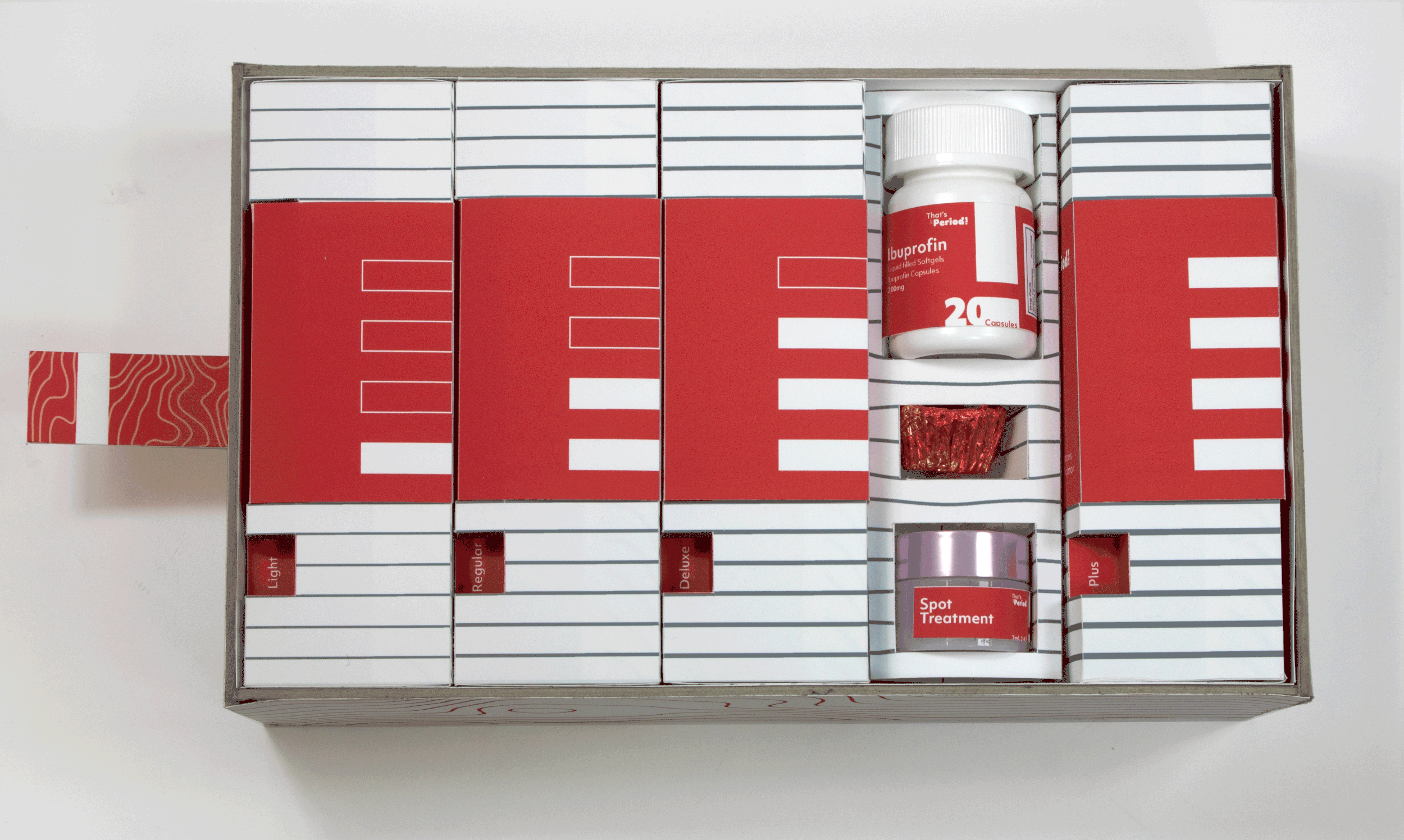
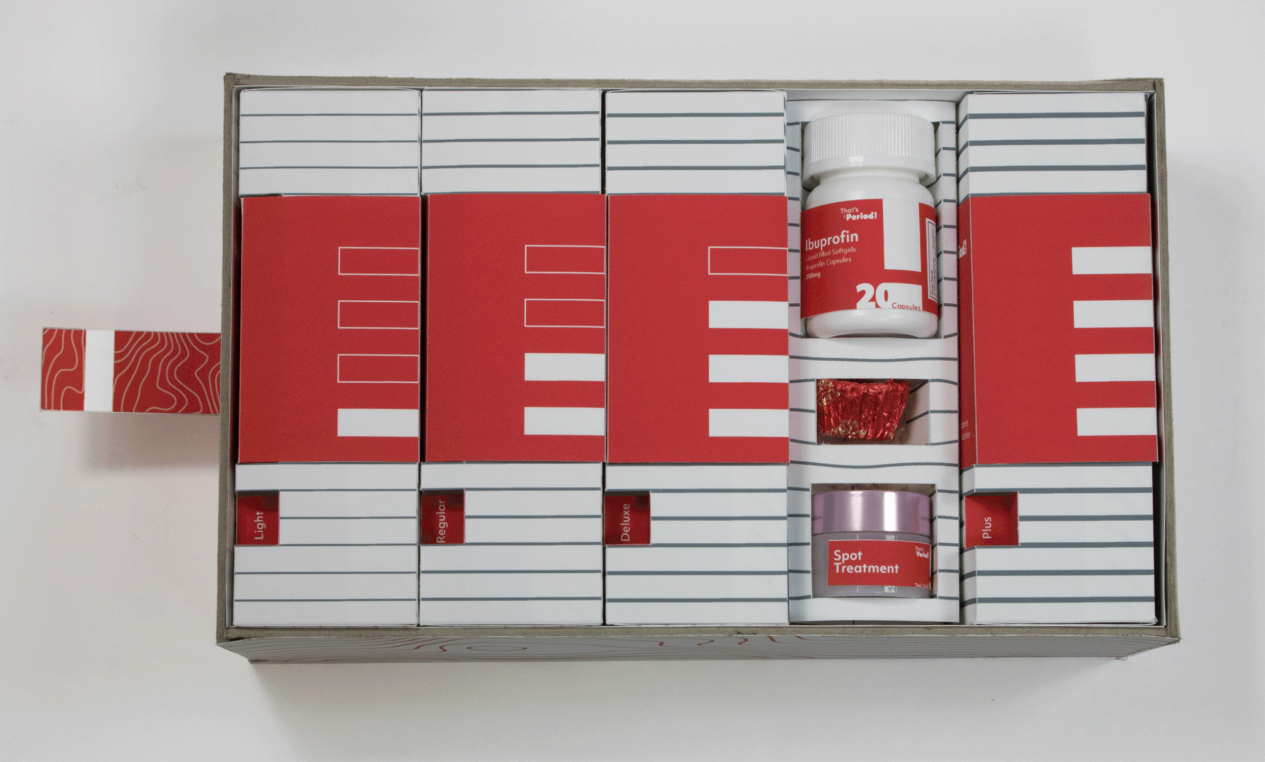
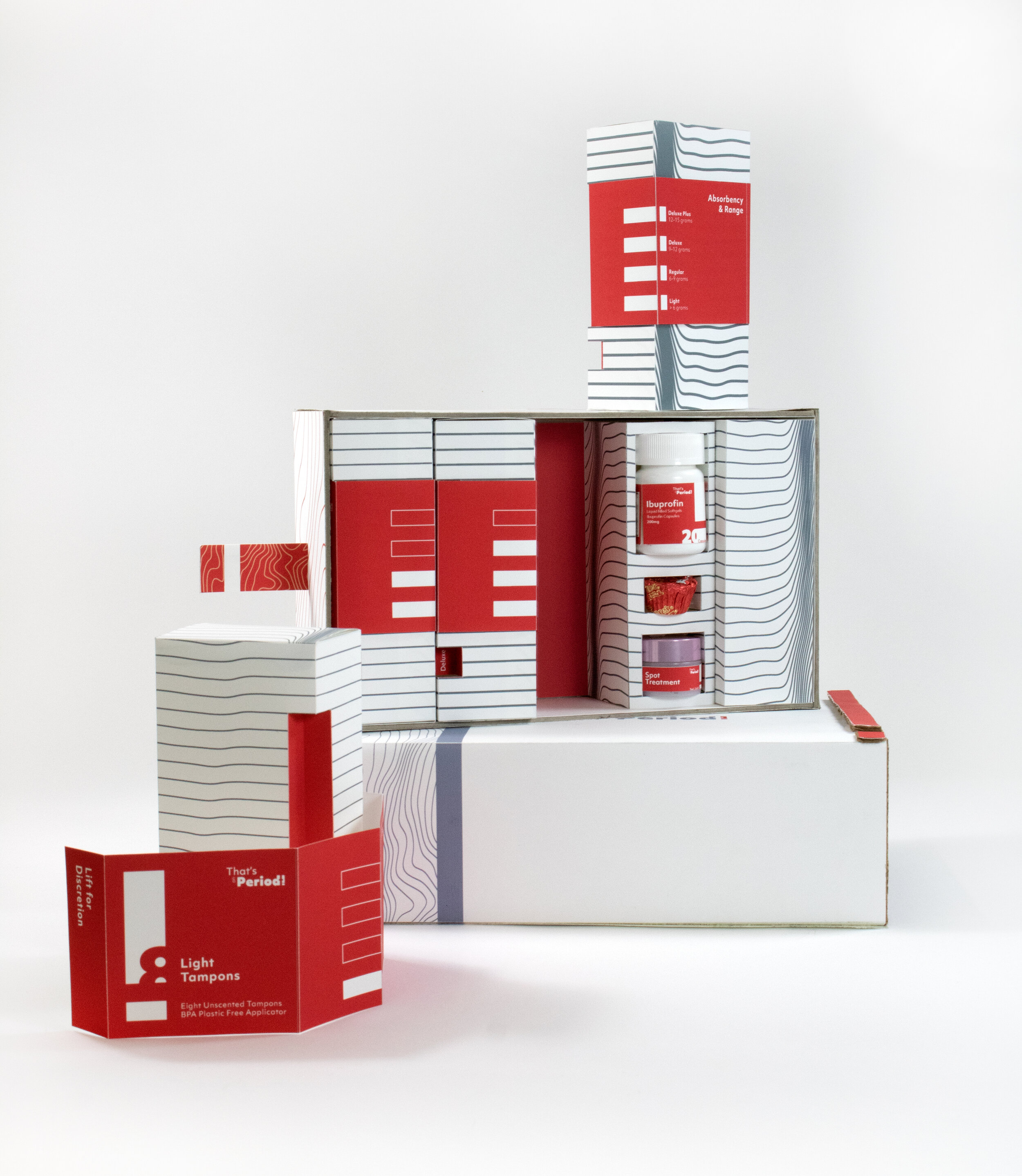
That’s On Periodt! Is a cutting edge brand in the world of tampons. Instead of designing to the fit feminine stereotype, as most tampon packaging is marketed exclusively at women, That’s On Periodt! looks beyond the binary. The company wanted a design system that conveys inclusivity and gender neutrality while remaining sleek and discrete as to not advertise the users' need for menstruation products because, everybody bleeds. They created a system where the user can input their custom tampon preferences, both type and amount, and every month a user is sent a kit to help them through the week. The kit includes tampons, rotating skin treatments to combat hormonal acne, and a small supply of Ibuprofen. Above all, That’s on Periodt! created a safe and positive experience for a person who lives beyond the binary to shop for tampons.
That’s On Periodt! Found its name from the LGBTQIA+ community, often used as an affectation. “Online shopping has got to be the best thing invented, That’s on Periodt!” I designed the T with a negative space relationship so those who were unfamiliar could also read periodt as period. From there, gender neutral colors inspired by the human body were chosen as well as vectored line drawings that represent flow and blood cells. The system follows a grid inspired by an exclamation point starting from the discrete outside sleeve to the removable tampon labels.